
Ontology Typeface
Ontology is a full-flavored sans font family. The project began by learning the anatomy of Arabic script through connected and positional letterforms. I was inspired by how the calligraphic gesture still influences modern Arabic type design, and wanted to bring that influence into the Latin character set. Typically, the Arabic letterforms for a font are designed after the Latin. I was attempting the reverse.
After consultation with native Arabic speakers and type designers, I recognized the need to pause and revisit the Arabic letterforms after a break. However, in doing so I had already brought some of the Arabic curvature into my Latin letters and hope to continue the process as time permits.
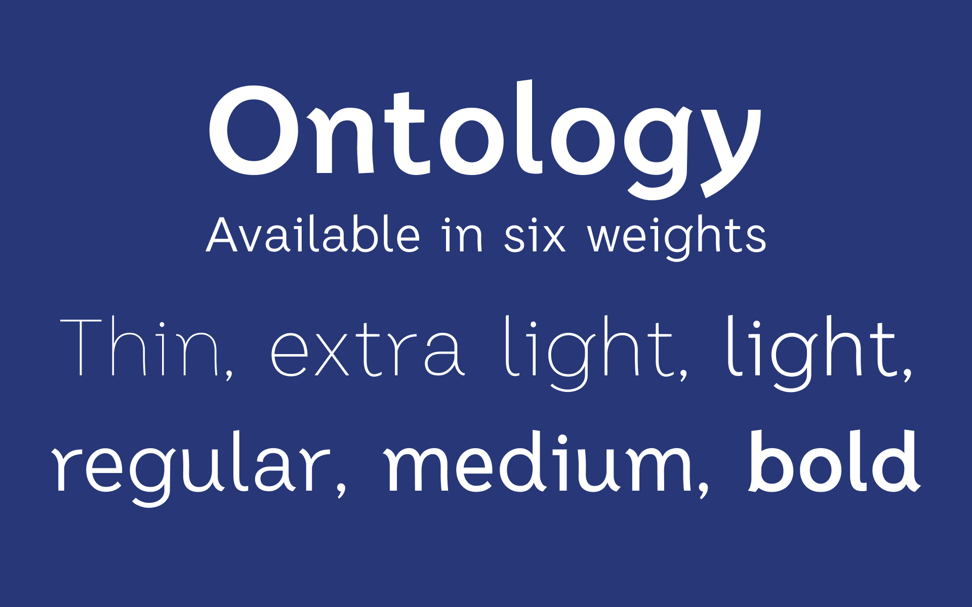
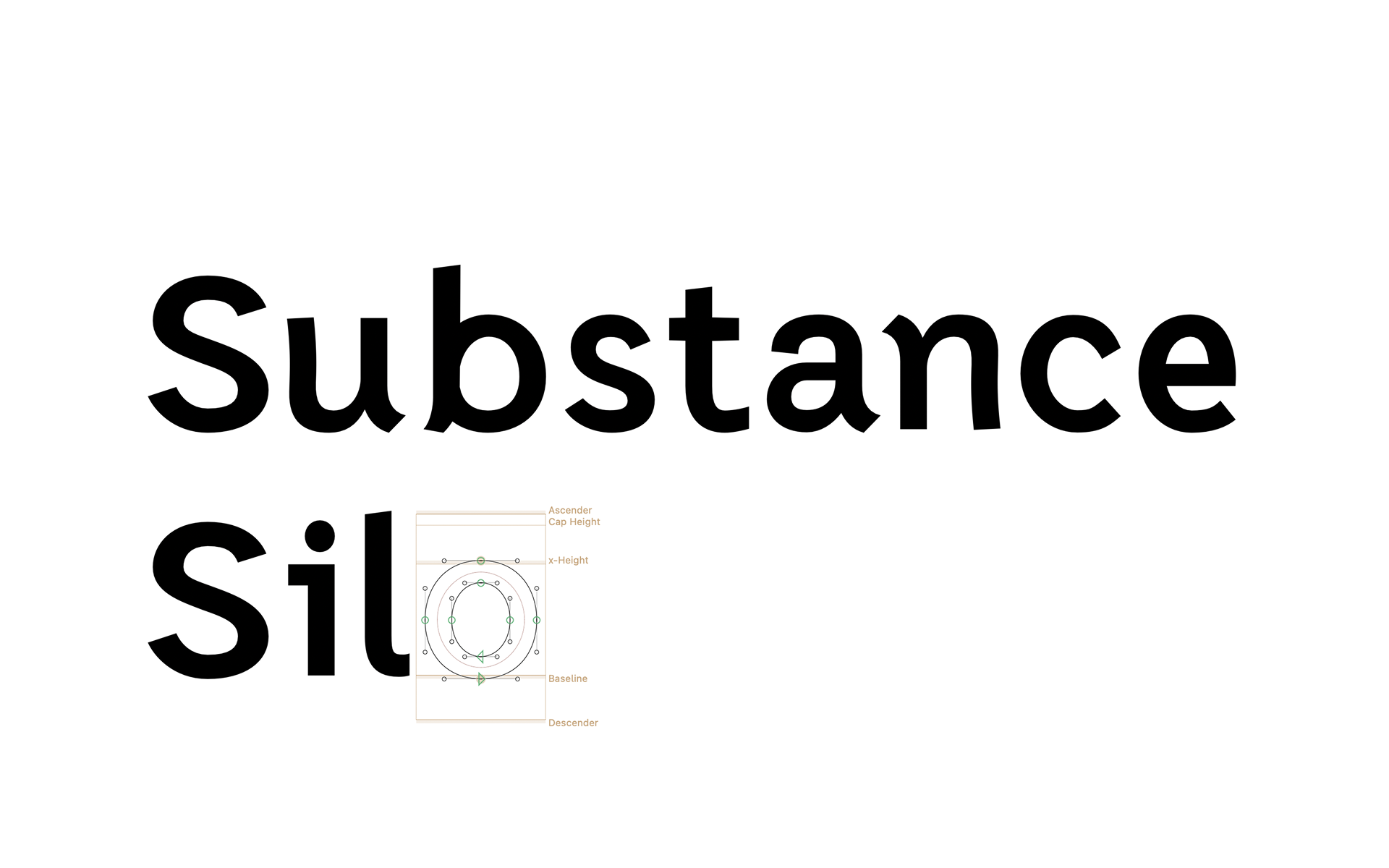
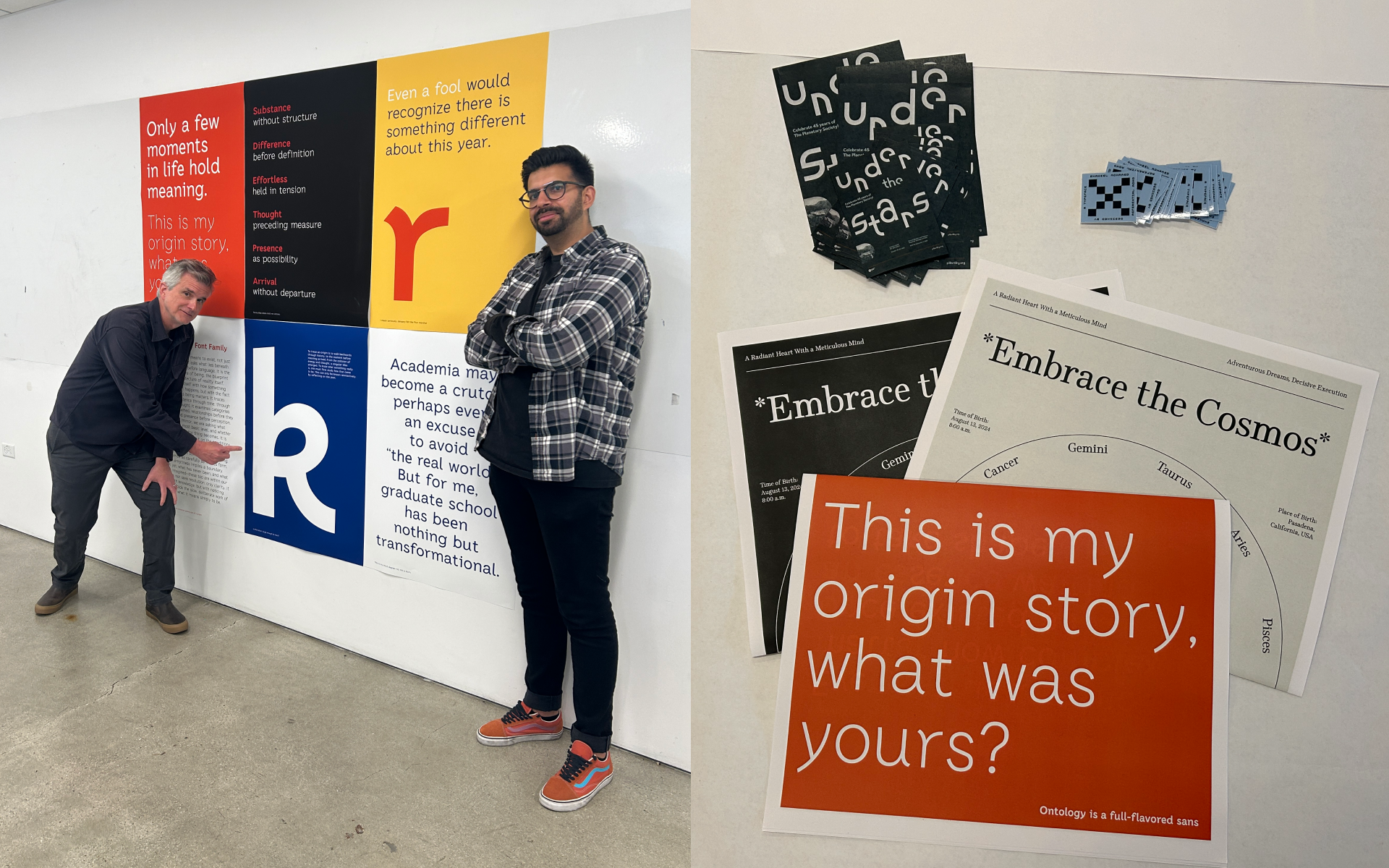
During the semester I designed two font weights (thin and bold) with four interpolated weights (extra light, light, regular, medium), along with six specimen posters, and a twelve page newsprint typeface specimen.
Future work includes: refined spacing, kerning pairs, sample print applications, and properly drawn weights for black and regular instead of relying on interpolation from bold to thin, along with revisiting the Arabic script.
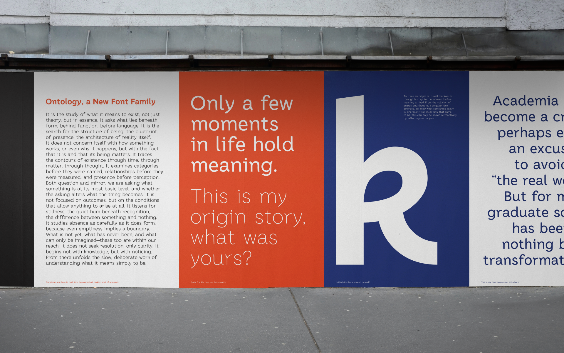
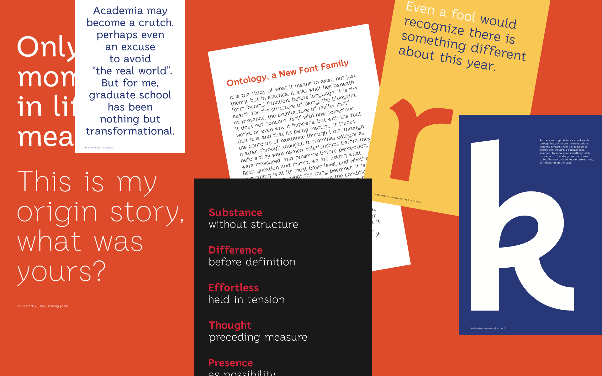
Posters to promote the typeface.
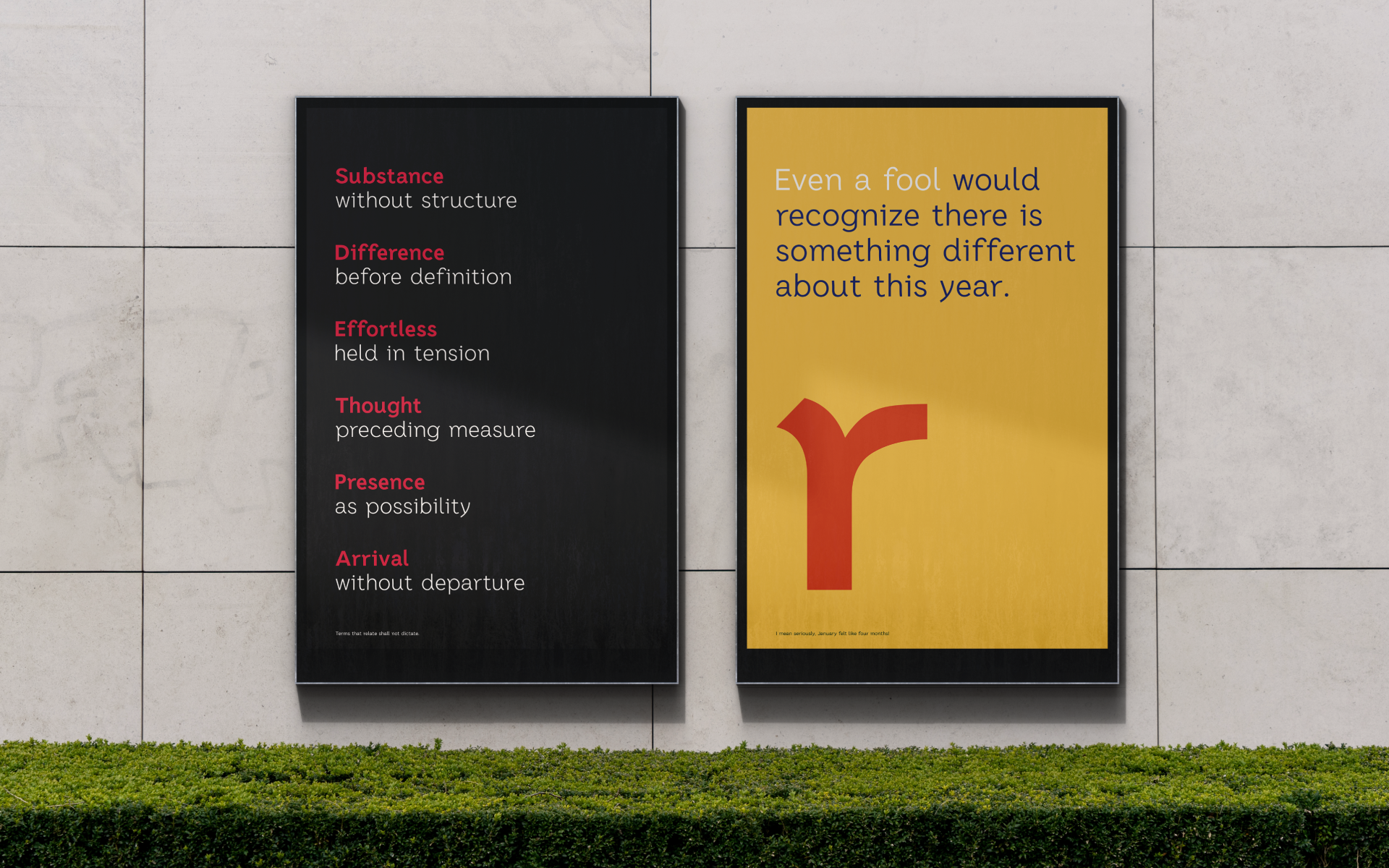
While designing the typeface, I was influenced, and at times overwhelmed, by major events in 2025.
Naming
I chose the name Ontology after putting the Arabic script aside and began to wonder what the purpose of this project was anymore. This reflection proved to be an important part of my process, slowing down to focus on details rather than focusing on the end result.
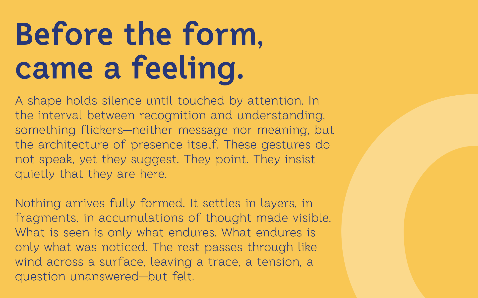
Newspaper type specimen front and back cover.
Newspaper type specimen designed to show features of the typeface.
Process
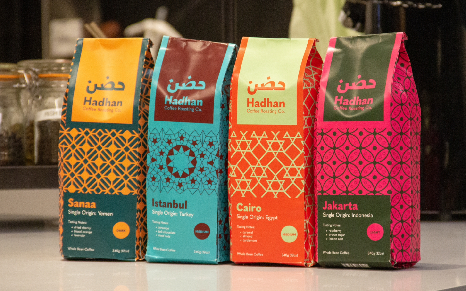
The typeface was inspired by my coffee packaging project, Hadaan (originally, Hadhan).
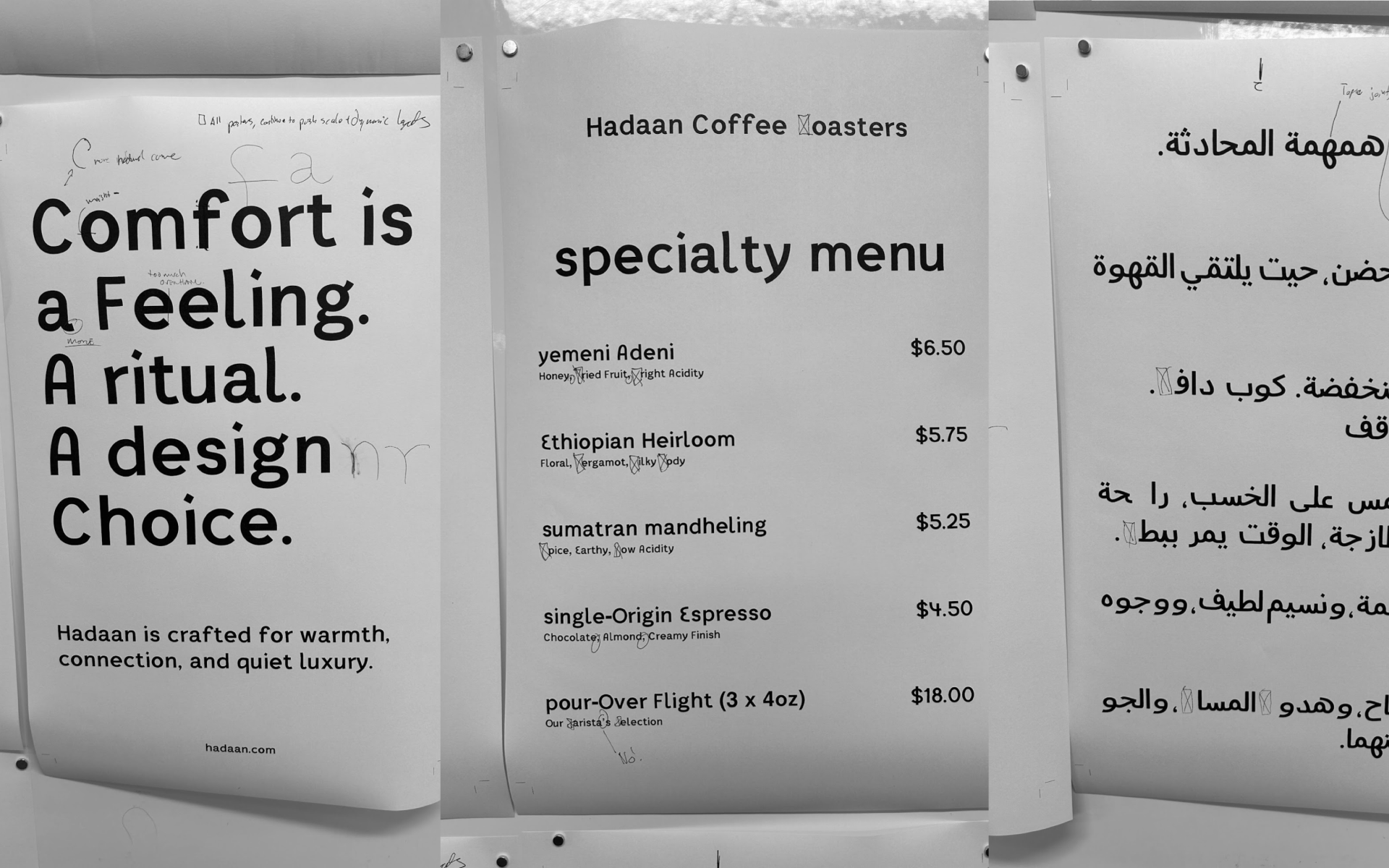
I thought about this becoming the brand font for Hadaan, perhaps even on a coffee menu.
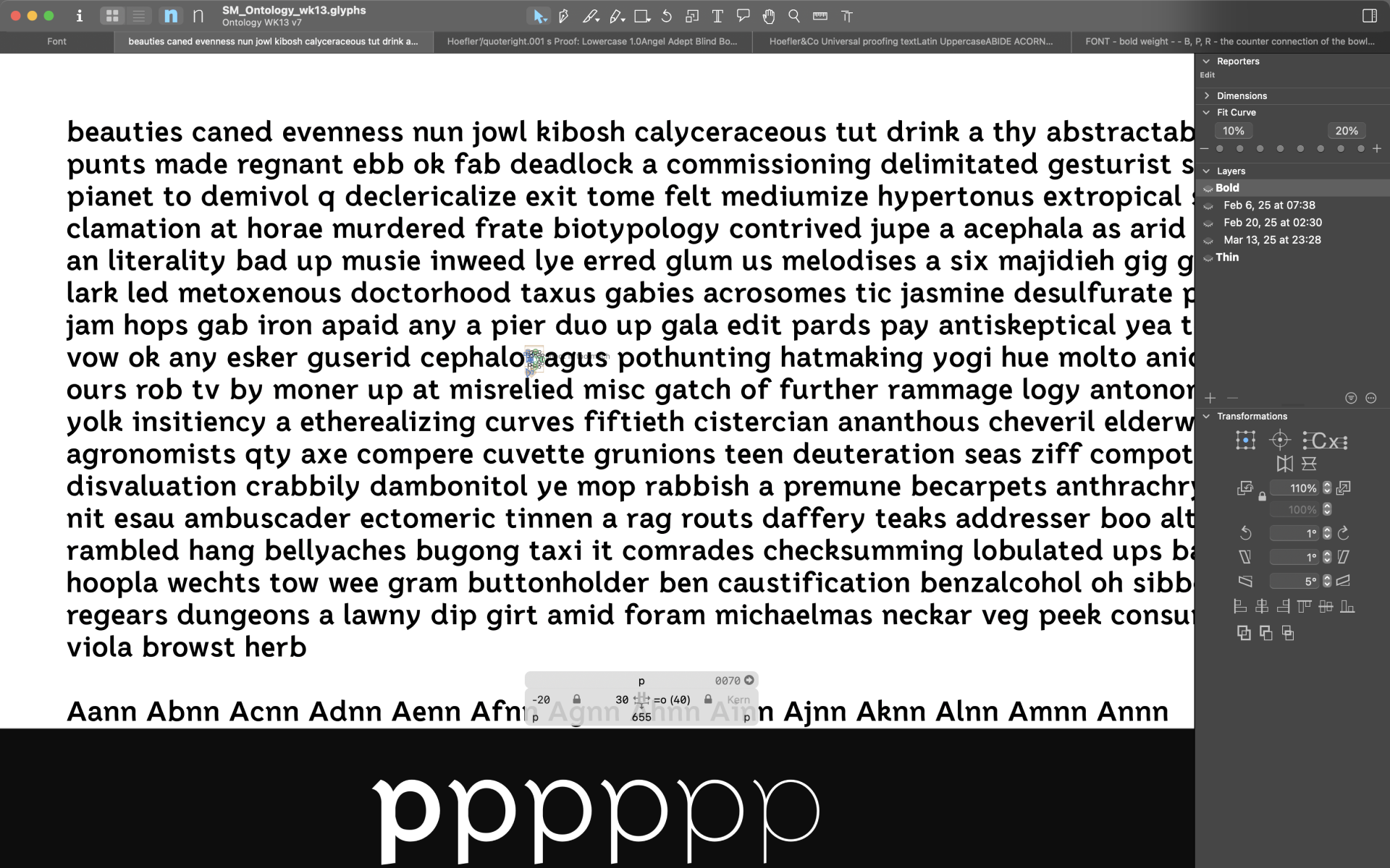
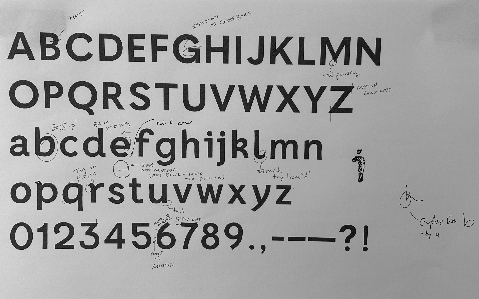
Weekly print outs and critique helped to gather instructor and peer feedback throughout the semester.
Though the Arabic is very incomplete, the design and critique has taught me a lot about the script. A big insight was how the opposite writing direction (right-to-left) influences the pen angle in calligraphy and appropriate proportions on Arabic letterforms accordingly.
The latest development (March 2025) of the Arabic script using a test word covering a majority of shapes and diacritic marks of the alphabet. I intend to revisit the Arabic letterforms soon, with a fresh perspective.
My final final at ArtCenter! In my presentation I reflected on the four (!!!!) typefaces that I designed during design school.
A last meeting with Yara Khoury Nammour during the last week of her HMCT residence.
Acknowledgements
Special thanks to instructor Greg Lindy and Yara Khoury Nammour for her instruction on the Arabic script while visiting ArtCenter as the 2025 HMCT Typographer-in-Residence. Additional thanks to Duolingo for helping me to learn the Arabic alphabet! Additional thanks to Krislam Chin of Hello World Studio and founder of the Work in Progress meetup.