Midjourney Strategic Rebrand
Midjourney as a company has received tremendous amounts of press since their founding in 2021, however non-technical audiences could be discouraged using it based on their visual communication. I aimed to help them remain competitive with the rapidly growing AI landscape by making the brand more approachable.
Special thanks to: Gerardo Herrera and Miles Mazzie.
The new Midjourney logo is an evolution of the previous sailboat symbol.
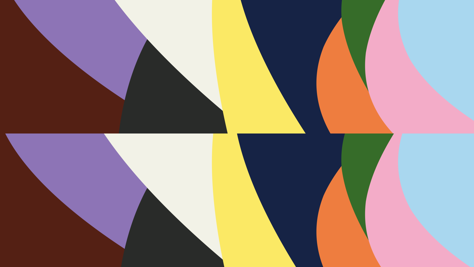
I was inspired by the Founder’s quotes, the mission statement, and light refraction as a metaphor for groundbreaking work they do within generative AI. The new brand colors are inspired by light refraction, symbolizing the expansive creativity possible with our products. These colors aim to connect with a broader audience across cultures, and industries.
The underlying strategy is rooted in remaining competitive with the many new generative AI companies emerging since 2021.

Though Midjourney has been a remote company, I wanted to imagine what their first HQ office space might look like. The HQ would feature a brushed stainless steel sculpture of the Midjourney sail outside.

The brand colors emerged from light refraction, symbolizing expansive creativity possible with their products.

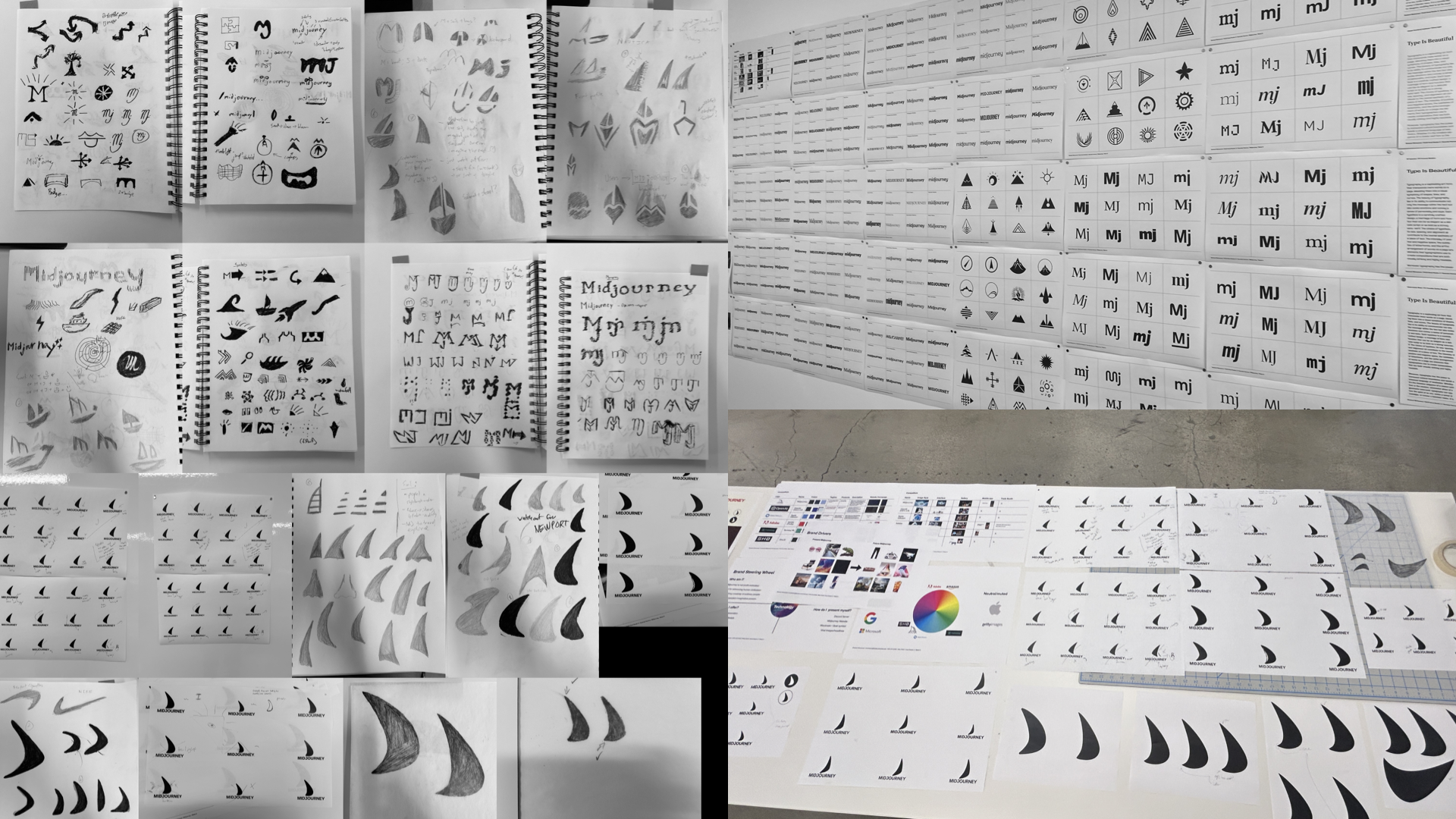
An exhaustive identity exploration of logo refinement with paper and digital sketches.

The brand colors emerged from light refraction, symbolizing expansive creativity possible with their products.

These colors aim to connect with a broader audience across cultures, ages, and industries. The primary color palette helps Midjourney stand out from the majority of tech companies.

Logo family system expressed through all brand colors: vertical lockup, icon, wordmark.

The active imagination (AI) pattern.


