
Mark Rothko Documentary Campaign
I designed a wordmark, posters, and accompanying booklet for a campaign promoting a PBS documentary about Mark Rothko, the abstract expressionist. My design concept was: in memoriam.
Depth of research and critique helped me to clarify the forms and vocabulary used throughout the project. Book colors were inspired by the Rothko Chapel in Houston, Texas. The non-denominational Chapel was one of Rothko’s final projects which he never saw completed before his passing.
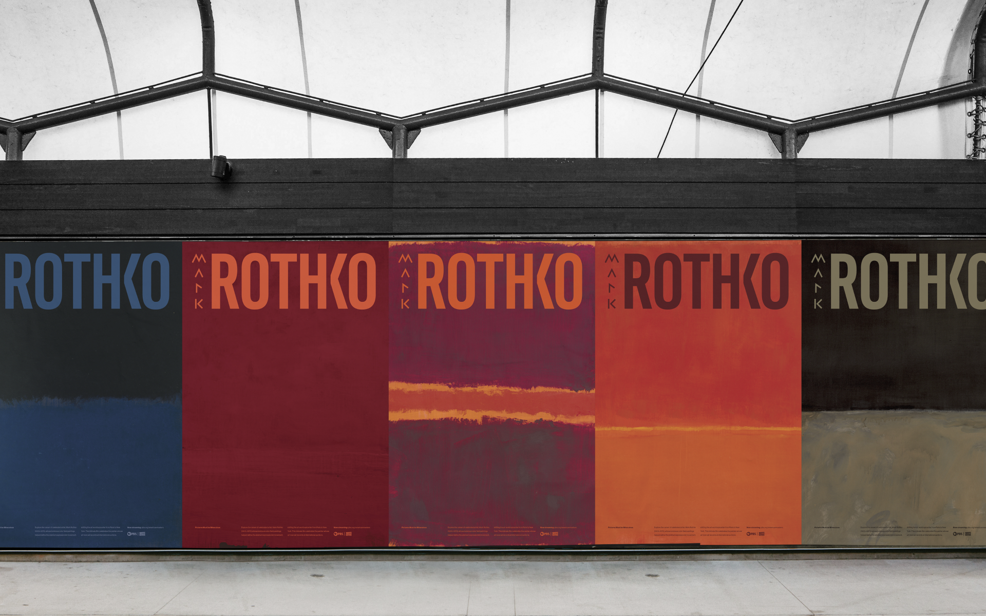
A poster series promoting the documentary episode. By placing content over the paintings, the reader is required to view the painting more intimately.
Varying the placement of “Mark” creates a dynamic element. Conceptually, this connects back to Mark Rothko’s many years of searching before finally settling on the style of art we know him for (and his legacy) as Rothko.
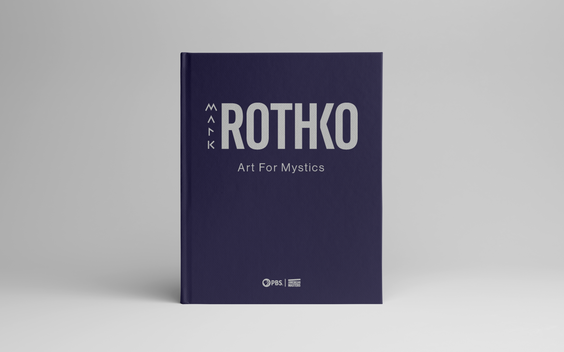
Extending the identity to a booklet required a special consideration for messaging. I chose the title “Art for Mystics”, based on the following definition for mystical: inspiring a sense of spiritual mystery, awe, and fascination. This sense of awe is due partly to the scale of Rothko’s paintings.
Table of Contents
- Preface — an introduction to Mark Rothko.
- Search — early explorations through his lesser known styles of art.
- Voice — a photo essay of his best known abstract works.
- Wisdom — his advice for new artists.
- Legacy — an interview with Christopher Rothko, his son, which informed my overall design direction.
- Reflection — my brief and emotional editorial capturing my thoughts as I completed the book.
His earlier and lesser known works inspired the various configurations of the wordmark.
Key spreads from the book showing my typographic restraint. By keeping the layout quiet, the content becomes the primary focus for the reader.
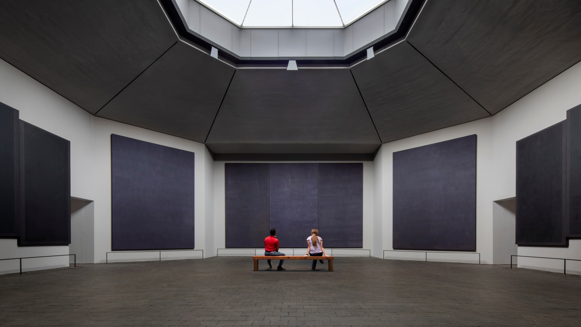
Colors were inspired by the Rothko Chapel in Houston, Texas. The non-denominational Chapel was one of Rothko’s final projects which he never saw completed.
Intro/outro: A few spreads guide the reader from from the everyday material world to that of the mystical, symbolized by a slow gray to purple gradient. The outro follows the sequence in reverse. This concept is based on an engawa, a Japanese architecture element to bridge the outside world to the home.
Displaying the identity lockup as an on-screen graphic (bug) during the documentary.
Process
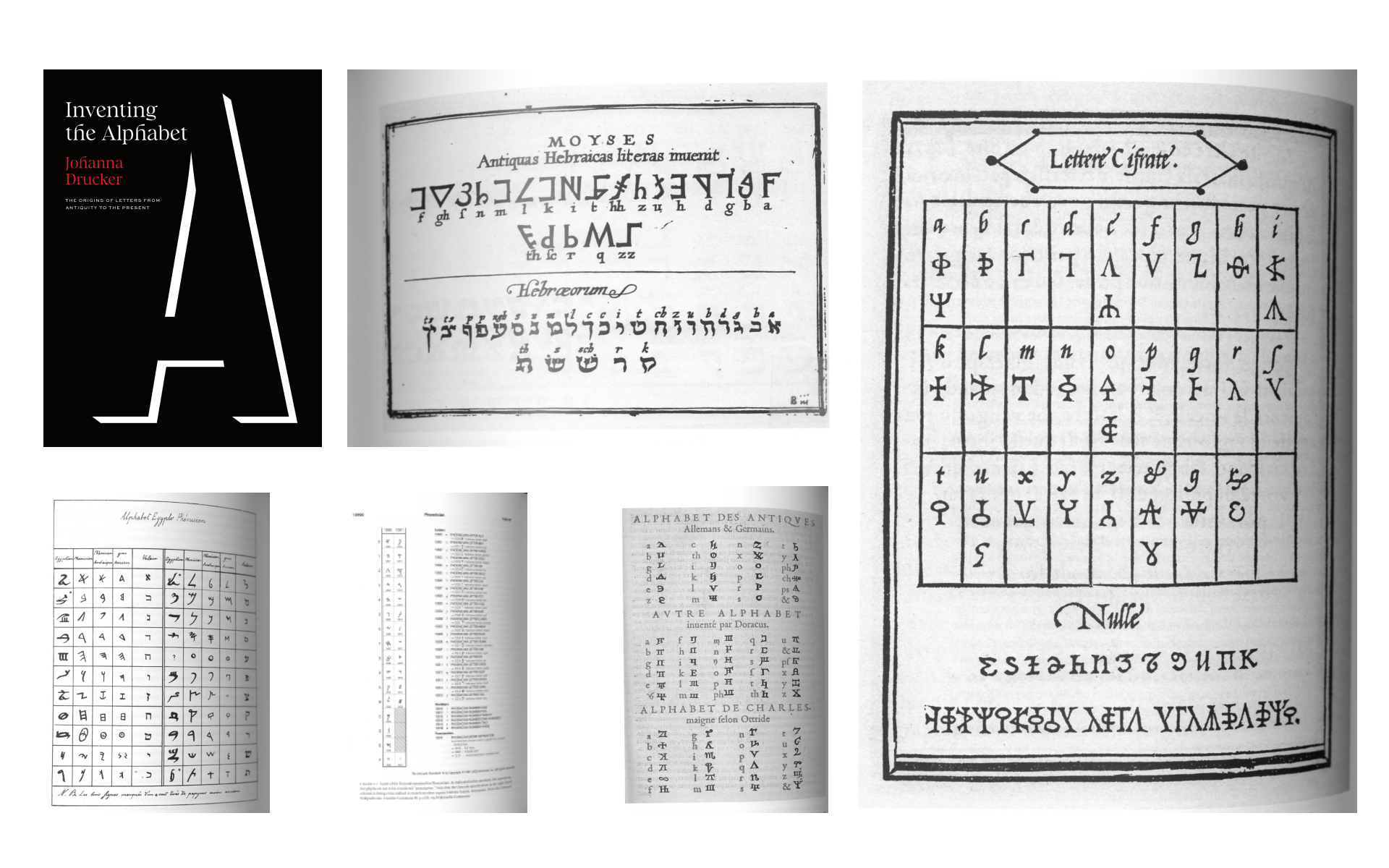
My research included reading Johanna Drucker’s recently released book, Inventing the Alphabet as I sought a deeper understanding for primitive letterforms. Conceptually, this aligned with Rothko’s ability to tap into the viewer’s primitive emotions with his artwork.
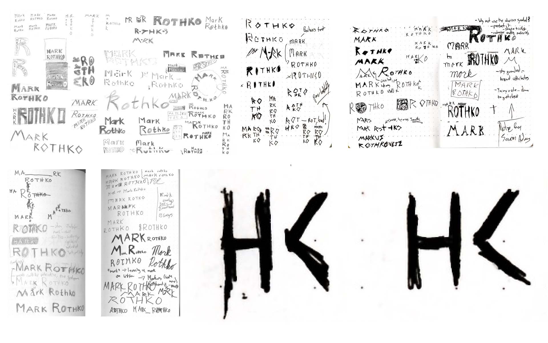
Various sketches during the wordmark design process which ultimately led to me discovering the magic of this H-K ligature to minimize visual clutter.
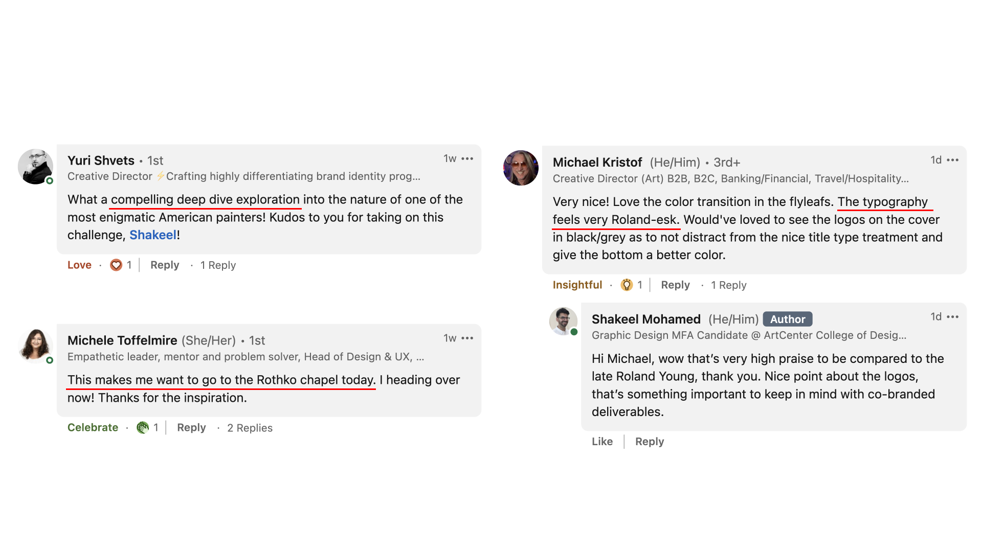
This was the first editorial project that I shared on LinkedIn, and the post received some unexpected praise.
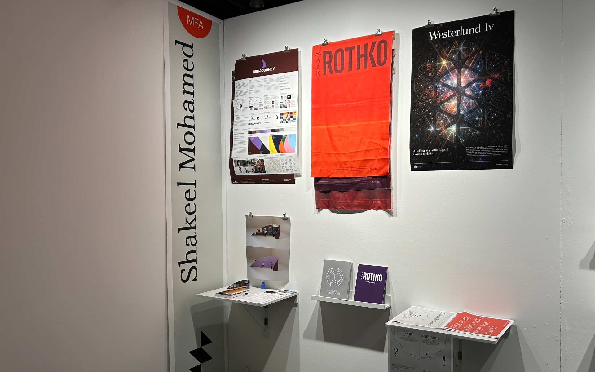
I printed fabric posters to display at my graduation show, embracing the canvas materiality of Rothko’s paintings.
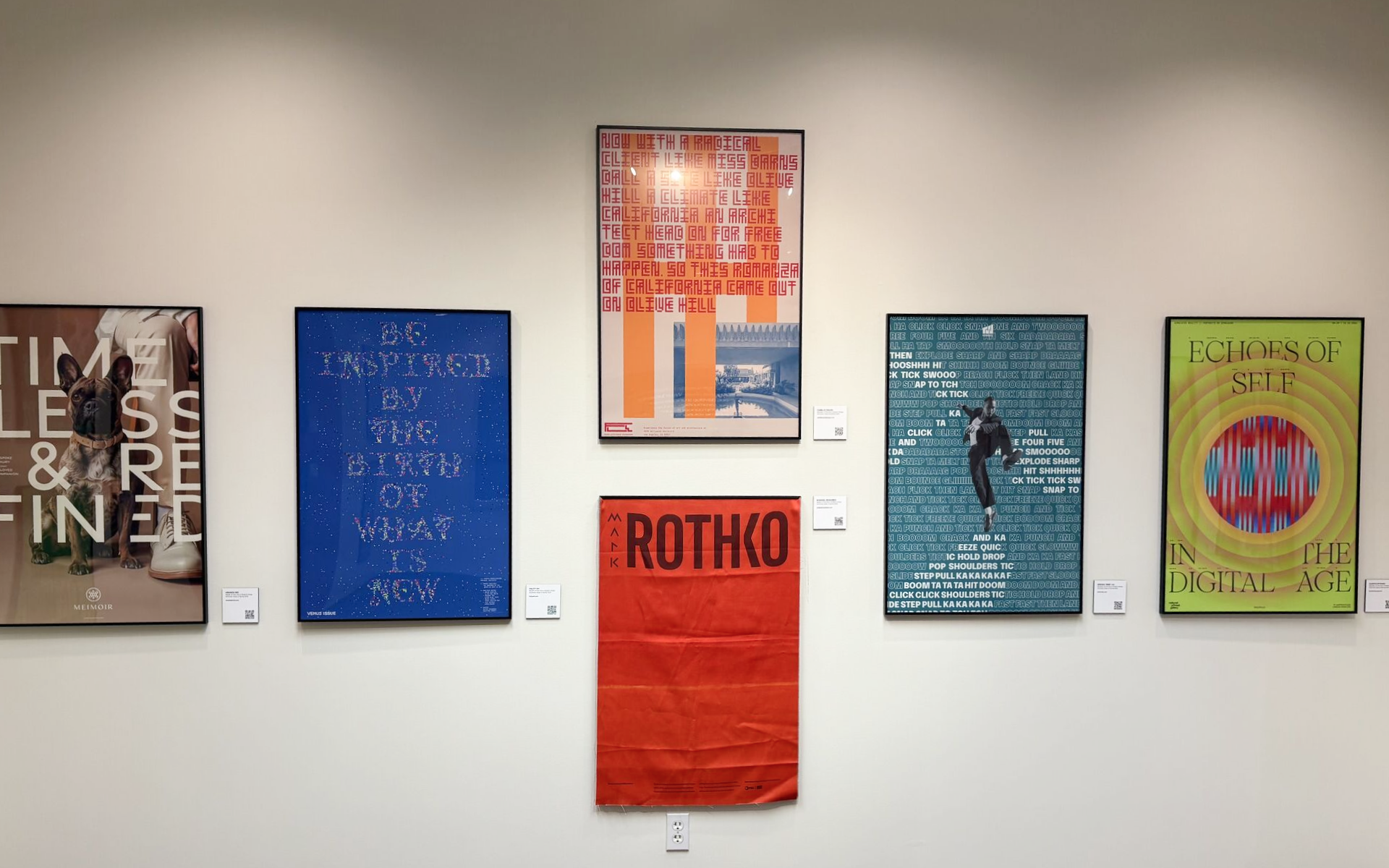
One of the fabric posters was selected for display in the Lithographix ArtCenter alumni gallery.
Acknowledgements
Special thanks to instructors Christian Perez-Morin, Cheri Gray, Greg Lindy, Michael Neal, ArtCenter alumni Erin Son and Sean Shang, with peer support from Vy Huynh, Xinman Jiang, Yvonne Ye, and Jen (Geyuzhen) Zhu. Additional thanks to the National Gallery of Art for high quality images of Rothko’s artwork, and to Architectural Digest for a beautiful photo of the Rothko Chapel.