Mark Rothko Documentary Campaign
I designed a wordmark, posters, and accompanying booklet for a campaign promoting a PBS documentary about Mark Rothko, the abstract expressionist. My design concept was: in memoriam.
Special thanks to: Christian Perez-Morin, Sean Adams, Michael Neal, Erin Son, Sean Shang, Brad Bartlett, and Greg Lindy of Lux Typo. Additional thanks to the National Gallery of Art for high quality images of Rothko’s artwork, and to Architectural Digest for a beautiful photo of the Rothko Chapel.
Depth of research and critique helped me to clarify the forms and vocabulary used throughout the project. Book colors were inspired by the Rothko Chapel in Houston, Texas. The non-denominational Chapel was one of Rothko’s final projects which he never saw completed before his passing.
Each chapter begins with a full spread. The chapter title is large, paired with a relevant Rothko quote on the opposite page.
- Preface — an introduction to Mark Rothko.
- Search — early explorations through his lesser known styles of art.
- Voice — a photo essay of his best known abstract works.
- Wisdom — his advice for new artists.
- Legacy — an interview with Christopher Rothko, his son, which informed my overall design direction.
- Reflection — my brief and emotional editorial capturing my thoughts as I completed the book.
I experimented with a rough augmented reality experience with Adobe Aero to view selected paintings when pointing a mobile device at the book cover.
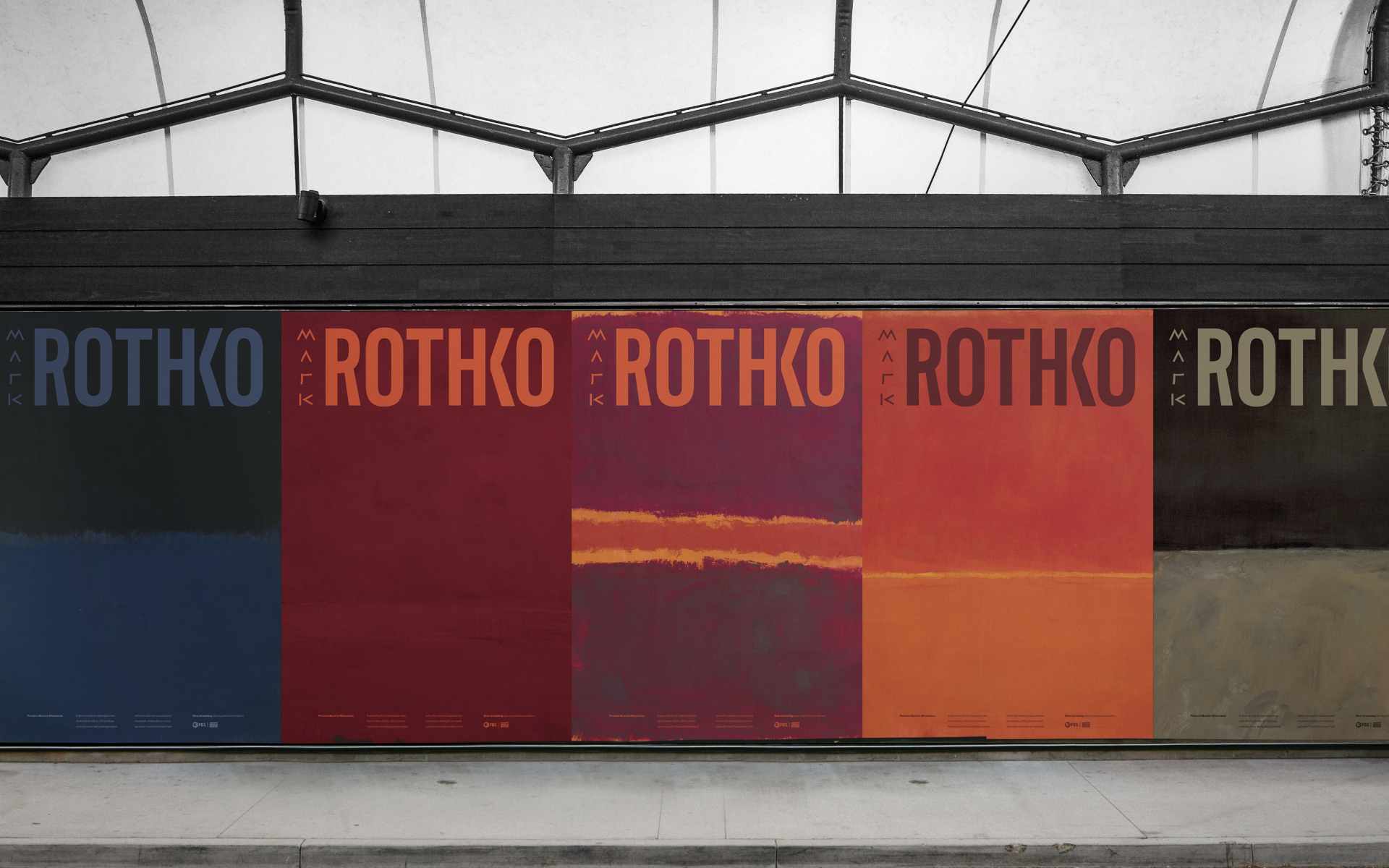
A poster series promoting the documentary episode.
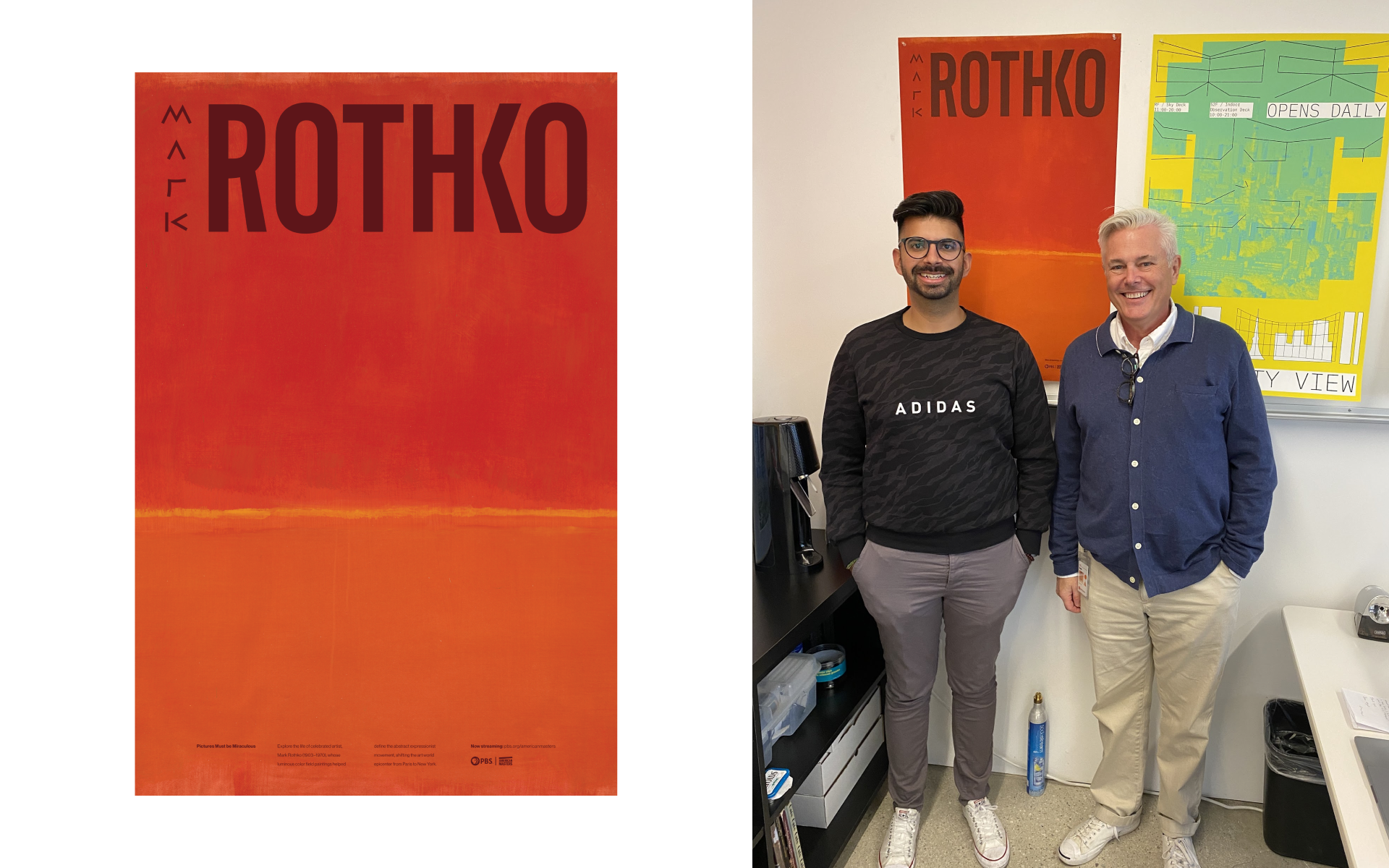
Sean Adams, the former Department Chair of Graphic Design at ArtCenter, selected one poster from the set to display in his office.
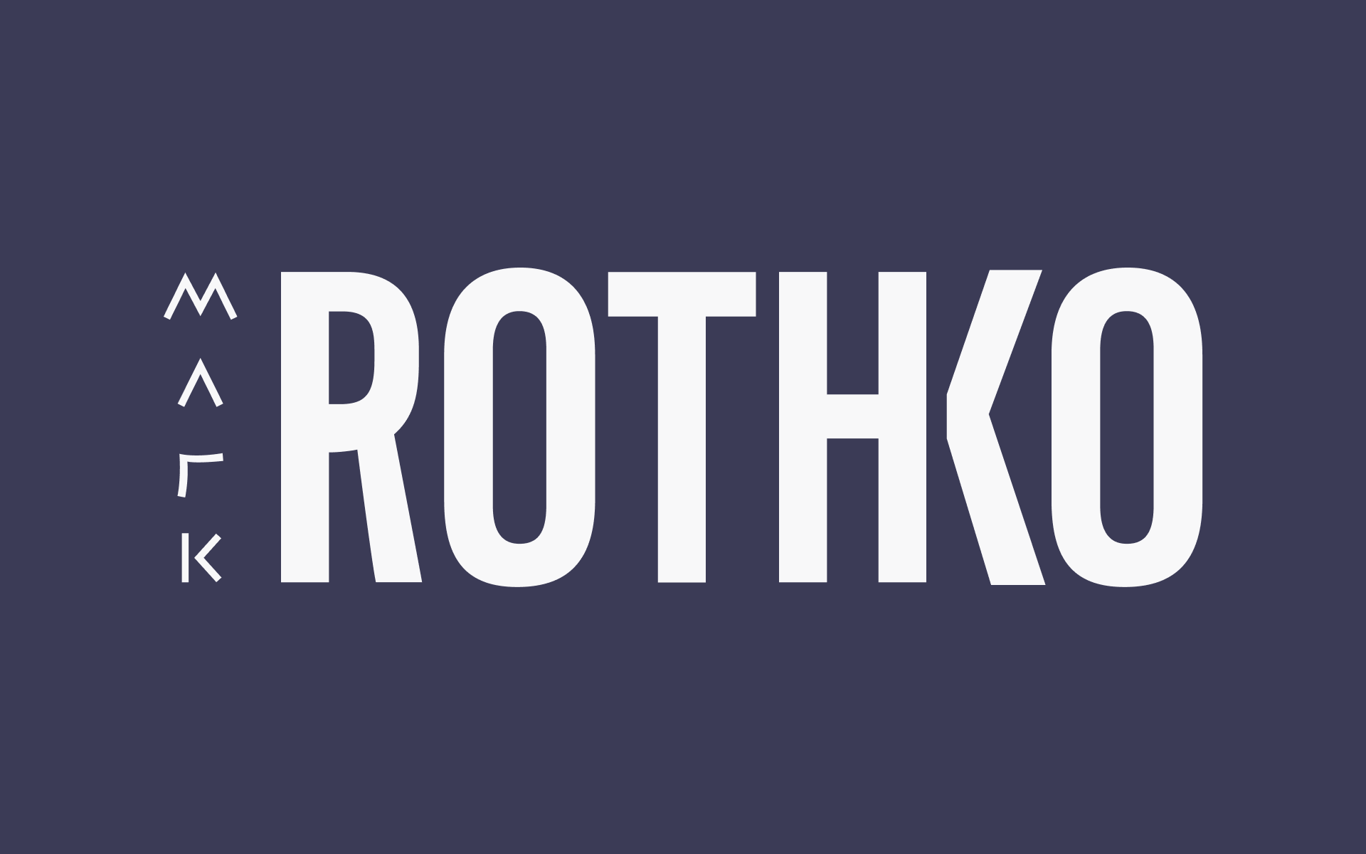
The final wordmark set on a purple inspired by the colors of Rothko’s paintings in the Rothko Chapel. The primitive forms for “Mark” tie back to the primitive emotions evoked by his work. While “Rothko” is set in all caps to symbolize the monolithic scale of his paintings.
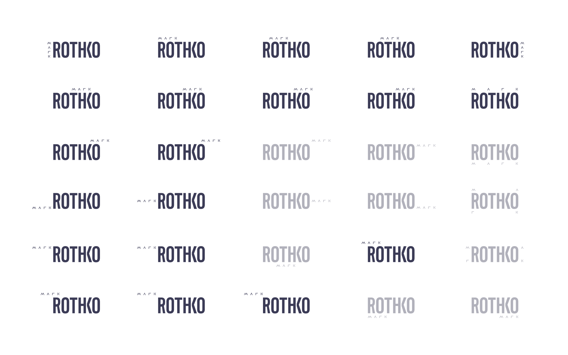
Varying the placement of “Mark” creates a dynamic element. Conceptually, this connects back to Mark Rothko’s many years of searching before finally settling on the style of art we know him for (and his legacy) as Rothko.
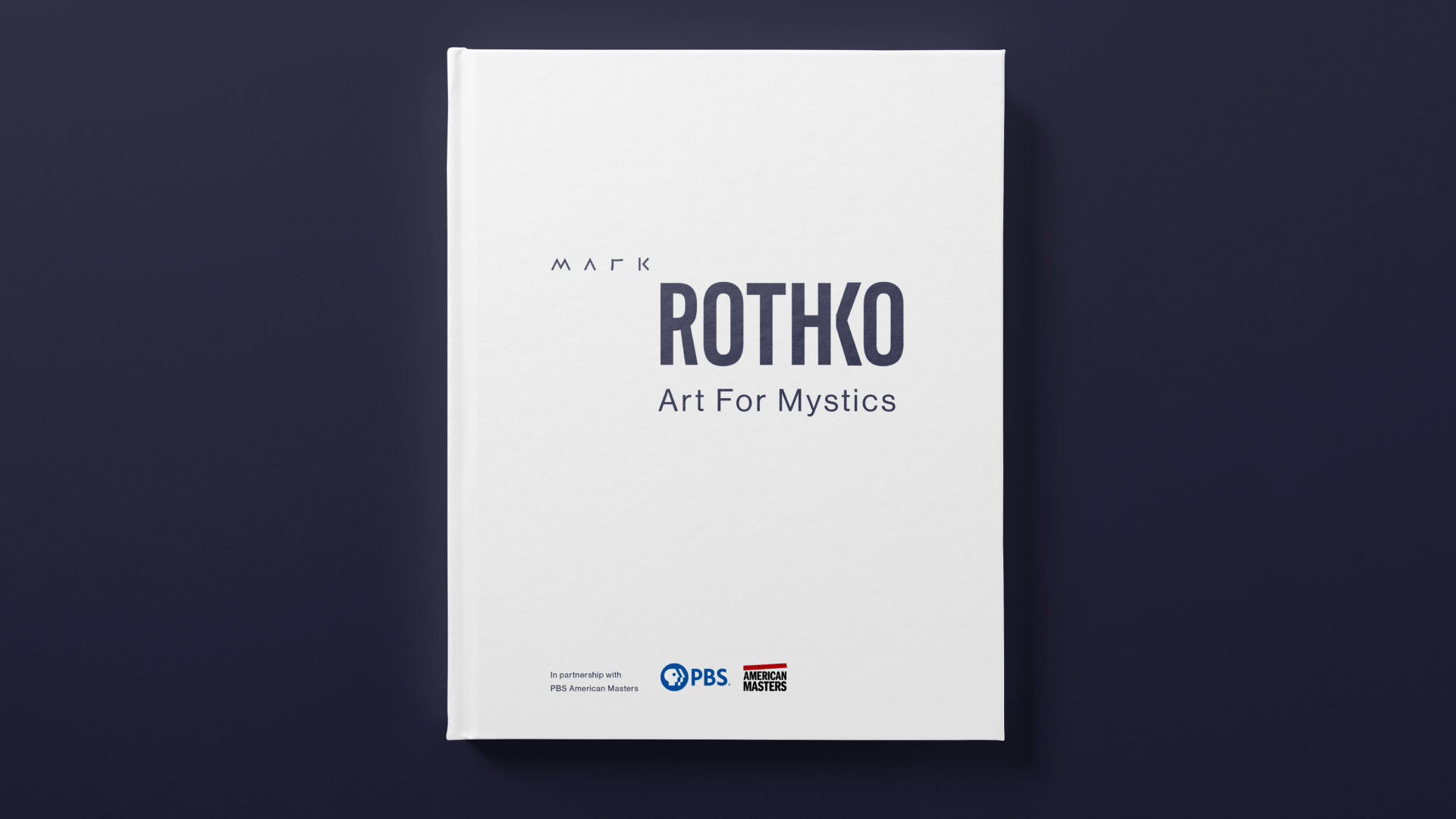
Extending the identity to a booklet required a special consideration for messaging. I chose the title “Art for Mystics”, based on the following definition for mystical: inspiring a sense of spiritual mystery, awe, and fascination. This sense of awe is due partly to the scale of Rothko’s paintings.
The complete book is available for viewing above.
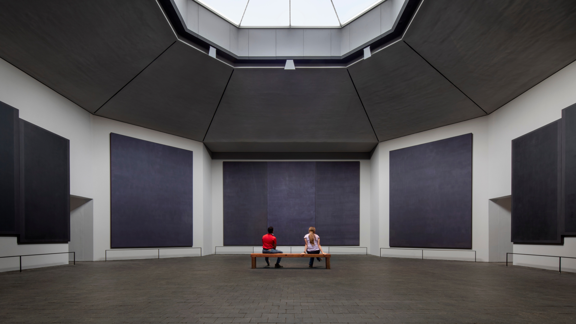
Colors were inspired by the Rothko Chapel in Houston, Texas. The non-denominational Chapel was one of Rothko’s final projects which he never saw completed.
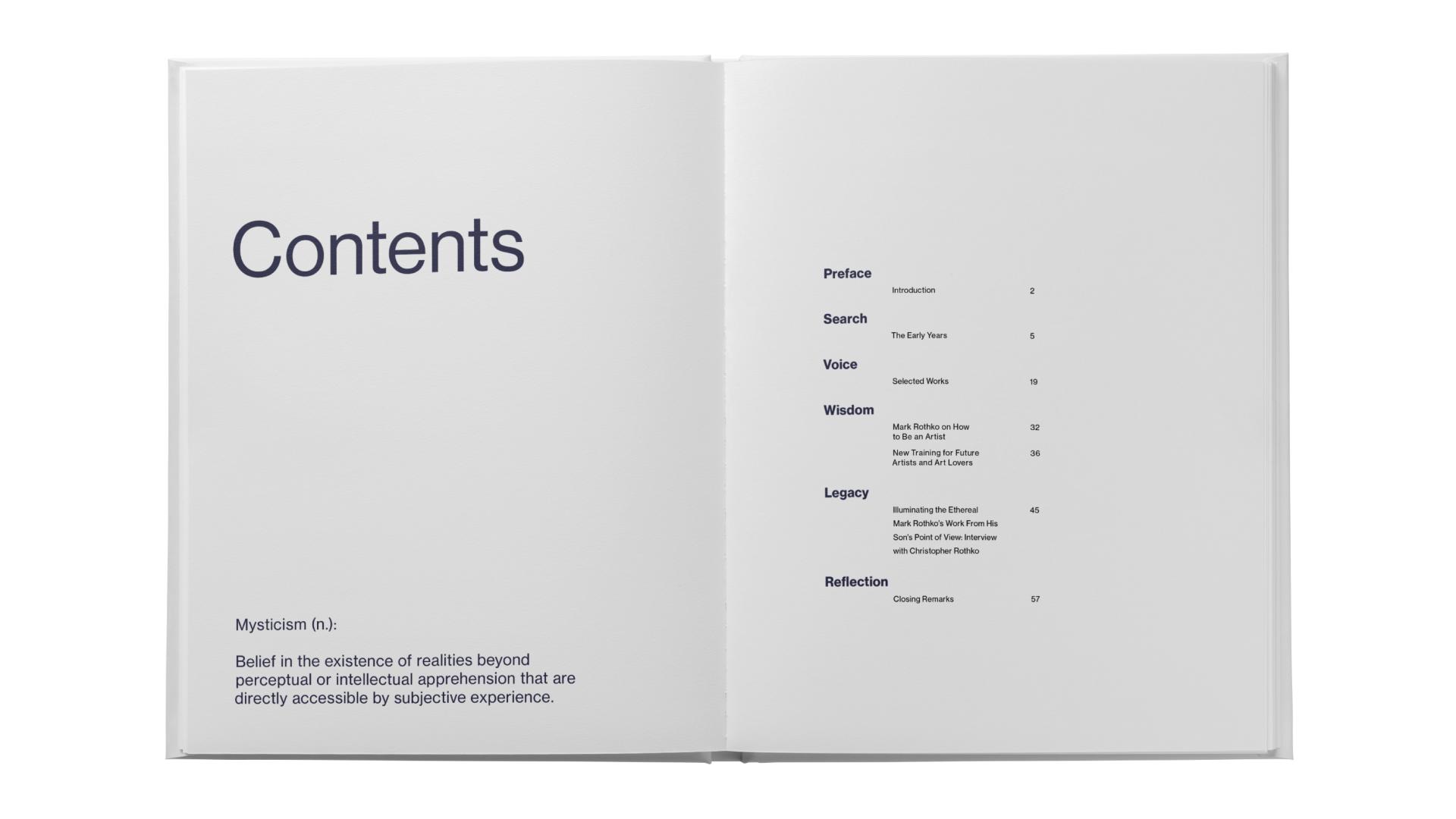
Recalling the definition of mysticism which inspired the publication title.
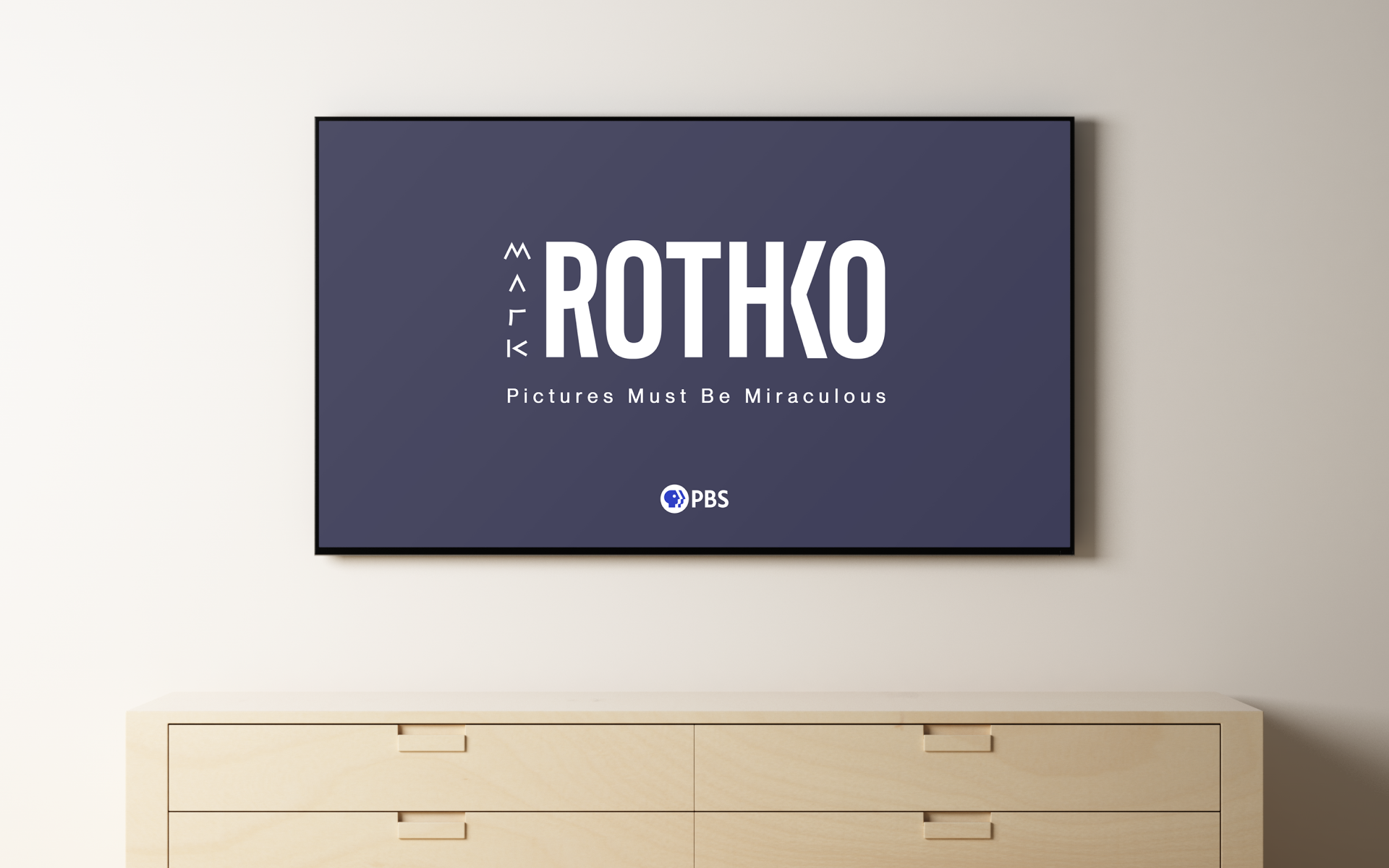
Envisioning the start of an opening title sequence for the documentary.
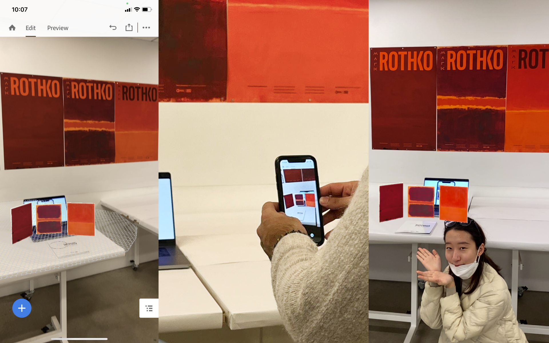
Screenshots of the augmented reality experience created using Adobe Aero.
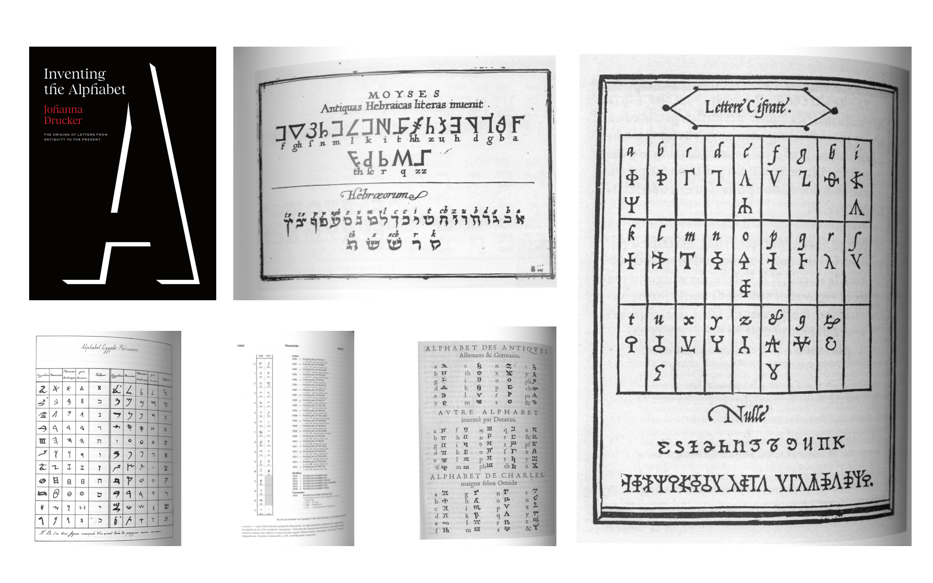
My research included reading Johanna Drucker’s recently released book, Inventing the Alphabet, as I saught a deeper understanding for primitive letterforms. Conceptually, this aligned with Rothko’s ability to tap into the viewer’s primitive emotions with his artwork.
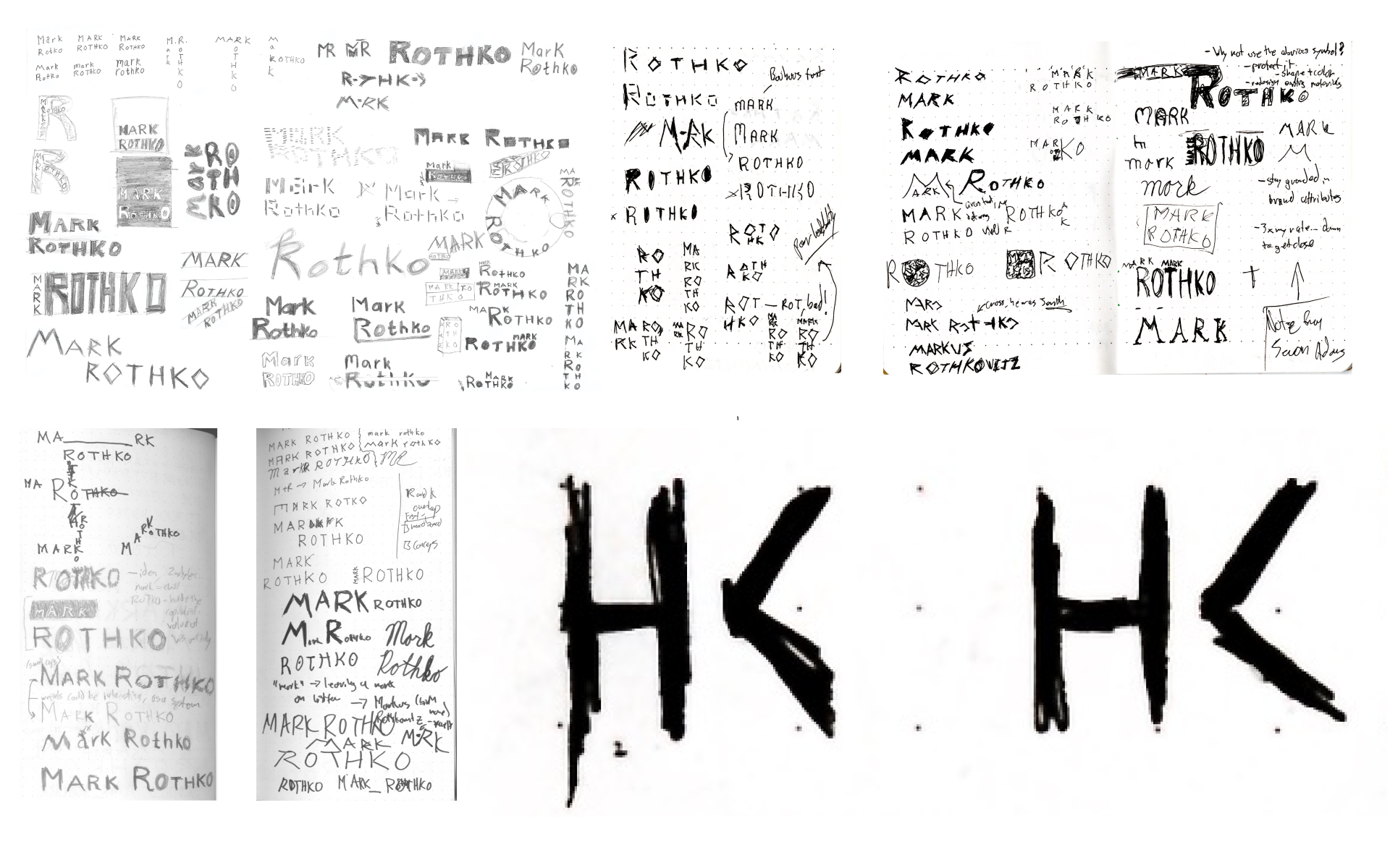
Various sketches during the wordmark design process which ultimately led to me discovering the magic of this H-K ligature to minimize visual clutter.
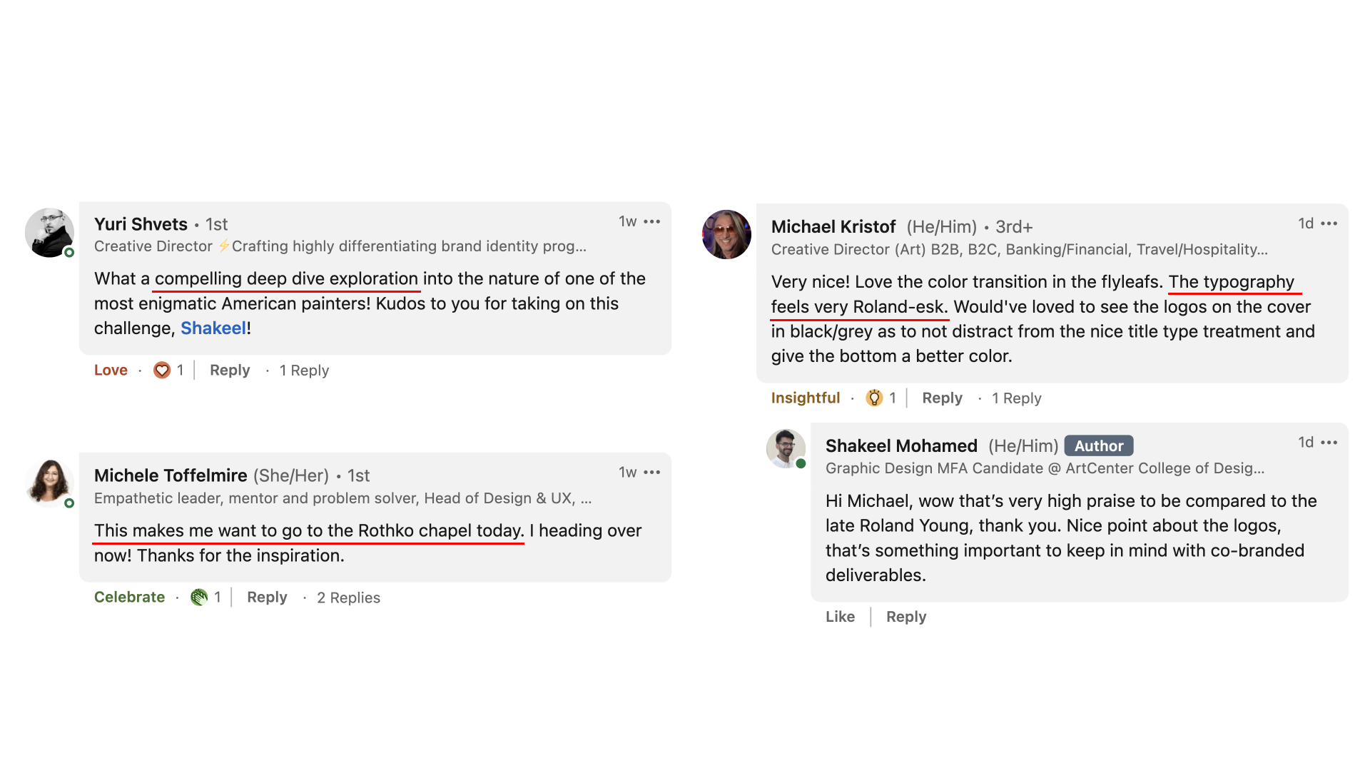
This was the first editorial project that I shared on LinkedIn, and the post received some unexpected praise.

